This article is for administrators.
Mobile-Friendly Benefits
It’s really important to make your website work well on phones and tablets. No matter how your company’s website looks, Recruiting lets you make your jobs page and job application easy to use on mobile devices.
Notes:
- If you use the newest version of our Careers Page and Application, you can easily make it mobile-friendly by reaching out to Recruiting Support.
- If you use an older version of the Careers Page and Application, it can take more time and might need extra help from your team. You might need to change some website code. If you aren’t sure what version you have or don’t see the settings mentioned, contact Recruiting Support for help.
Steps to Configure Your Careers Page
Important: You must be an administrator to perform this task.
- Go to People > Hiring > Applicant Tracking. You see your Recruiting dashboard with active jobs.
- At the top, click Admin and then click Careers Page.

- On the left side, in the Mobile Settings section, select one of these options:
-
Do not use mobile:
- This is the default setting.
- This option does nothing to enable responsiveness (Mobile Apply is disabled).
-
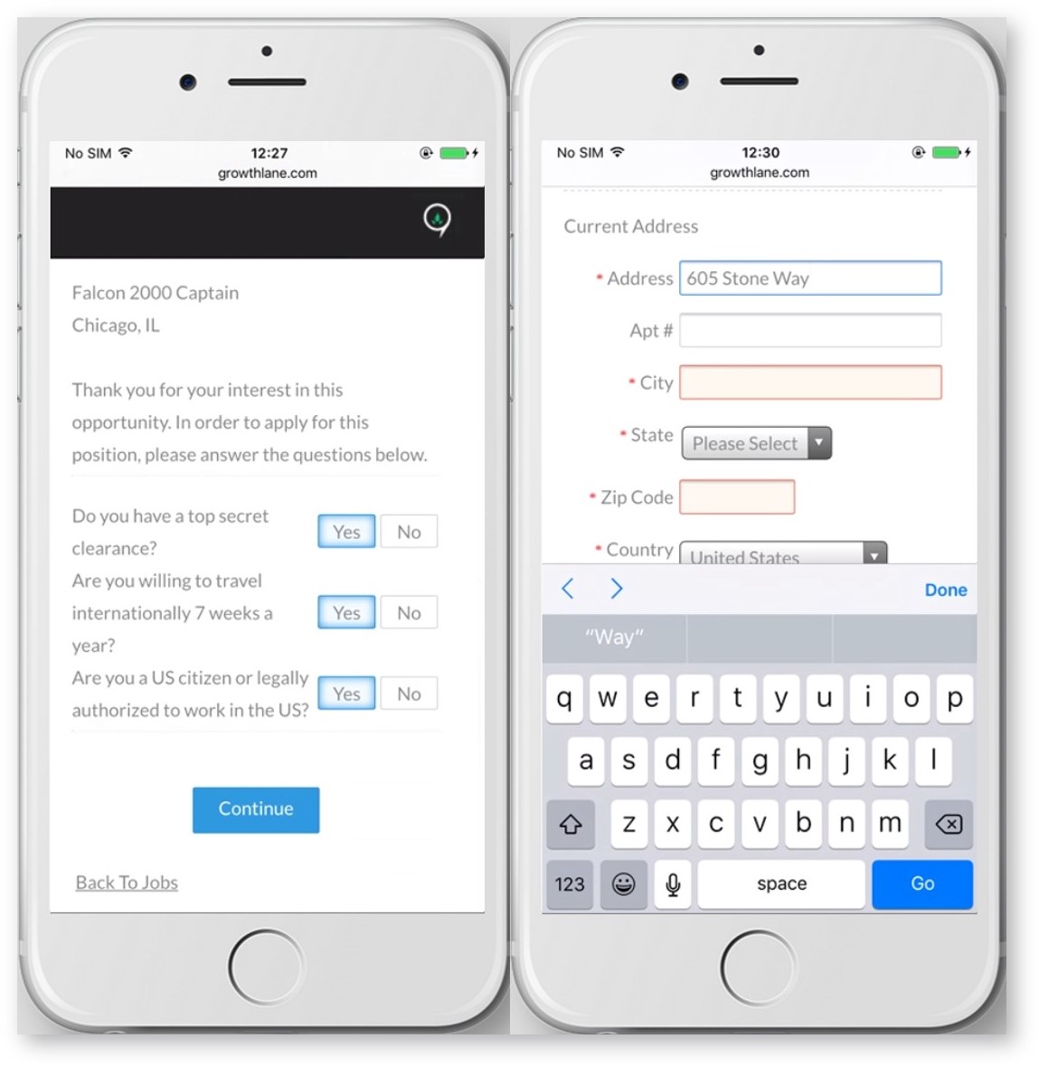
Responsive Mobile:
- This option modifies the Recruiting content on your careers page and application to be responsive.
- Choose this option if your overall website is already designed to be responsive.
- Unsure if your website is responsive? An easy way to tell is to view it on a mobile device to see if it looks different than on a larger laptop/desktop screen. You can also load up your website on your computer, then resize the browser window down to the size of a mobile device. If the layout changes or navigation bars collapse down, chances are your site is responsive.
- Here's an example of a responsive web page.
-
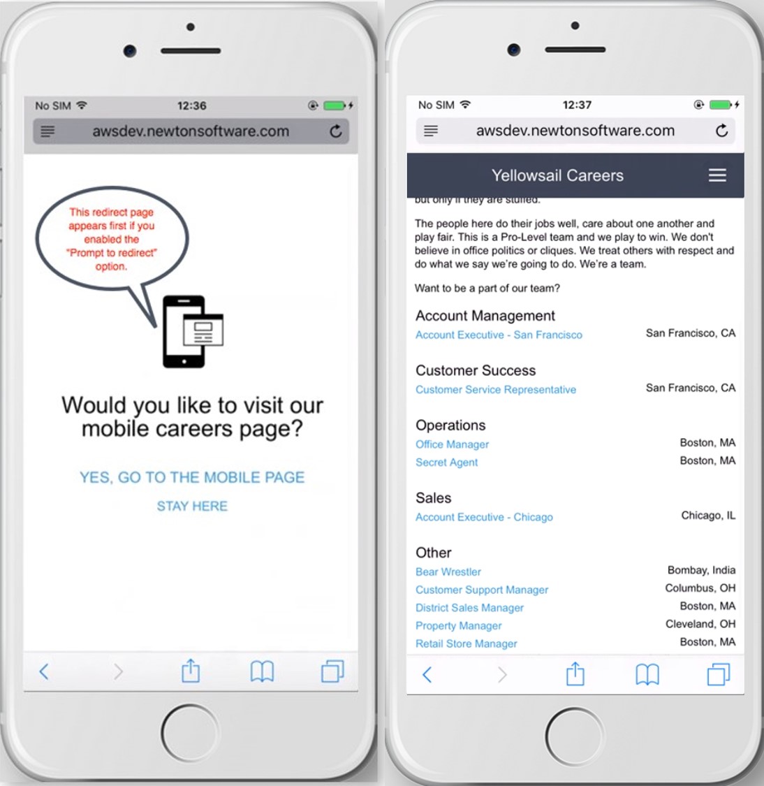
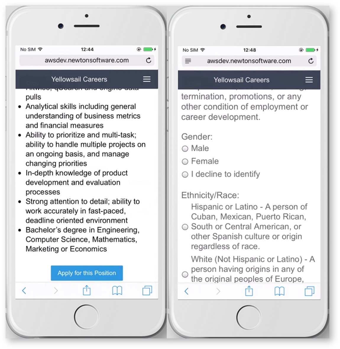
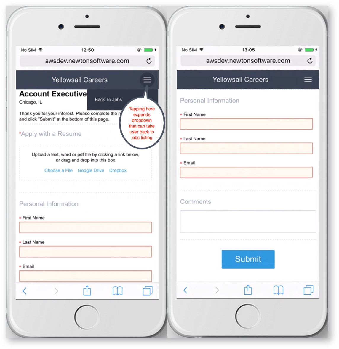
Push Mobile:
- This option completely takes over the page by redirecting to a mobile experience built from scratch. All company-specific content is replaced by a standardized version with headers, footers, and a cascading style sheet (CSS) that provides users with a clean, responsive experience.
- On IFrame sites, applicants are redirected out of the IFrame.
- Choose this option if your overall website is not yet responsively designed.
-
Prompt to Redirect:
- Select this option if you want to ask applicants whether or not they want to be redirected to the mobile version of the careers page.
- If it is left unchecked, the applicant is automatically redirected.
Mobile-Friendly Examples
Responsive Mobile Option Screenshots:
Note: The branded header comes from the parent page.
Push Mobile Option Screenshots:
Updated: December 18th, 2025 4978 views 0 likes
*This content is for educational purposes only, is not intended to provide specific legal advice, and should not be used as a substitute for the legal advice of a qualified attorney or other professional. The information may not reflect the most current legal developments, may be changed without notice and is not guaranteed to be complete, correct, or up-to-date.